Difference between revisions of "2024 Code4Lib T-Shirt Design Competition"
ElaineKong (Talk | contribs) (Created page with "Voting is now open for the Code4Lib 2024 T-shirt design! The winning logo will be featured on the front of this year's conference t-shirt. Voting will close on Friday, March 8...") |
ElaineKong (Talk | contribs) |
||
| (One intermediate revision by the same user not shown) | |||
| Line 1: | Line 1: | ||
Voting is now open for the Code4Lib 2024 T-shirt design! The winning logo will be featured on the front of this year's conference t-shirt. Voting will close on Friday, March 8, 2024. | Voting is now open for the Code4Lib 2024 T-shirt design! The winning logo will be featured on the front of this year's conference t-shirt. Voting will close on Friday, March 8, 2024. | ||
| − | You can cast your vote here: https:// | + | You can cast your vote here: https://forms.gle/cxoTACEAZNMdYi3T7. The voting form will require you to log in with a Google account to ensure one vote per person. |
== Details == | == Details == | ||
| Line 21: | Line 21: | ||
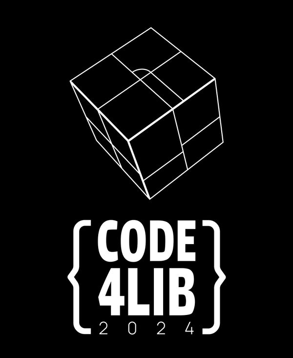
My design features a vector drawing of an iconic sculpture on U-M's campus, where the conference is being held this year, and the text "Code 4 Lib 2024" in brackets as a spin off of the existing code 4 lib logo. Black and white is great for this design! | My design features a vector drawing of an iconic sculpture on U-M's campus, where the conference is being held this year, and the text "Code 4 Lib 2024" in brackets as a spin off of the existing code 4 lib logo. Black and white is great for this design! | ||
| + | |||
-------------------------- | -------------------------- | ||
| Line 29: | Line 30: | ||
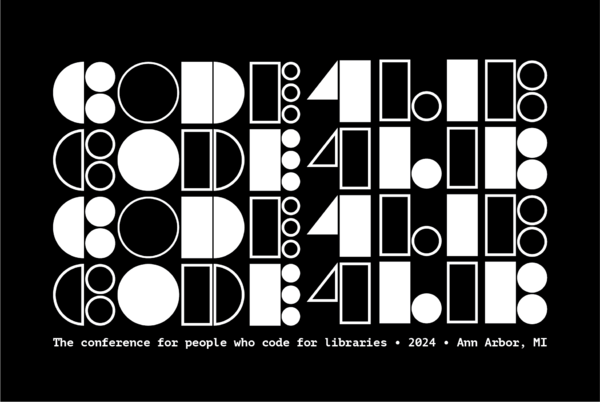
My inspiration was a black & white cookie. I aimed for interesting geometric forms and nearly unreadable funkiness offset by explanatory text. | My inspiration was a black & white cookie. I aimed for interesting geometric forms and nearly unreadable funkiness offset by explanatory text. | ||
| + | |||
-------------------------- | -------------------------- | ||
| Line 37: | Line 39: | ||
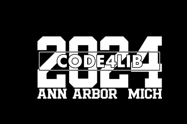
Typographic-centric design inspired by the University of Michigan typefaces but in monochrome for single-color. This would also work well on a "Michigan Blue" shirt. | Typographic-centric design inspired by the University of Michigan typefaces but in monochrome for single-color. This would also work well on a "Michigan Blue" shirt. | ||
| + | |||
-------------------------- | -------------------------- | ||
| Line 45: | Line 48: | ||
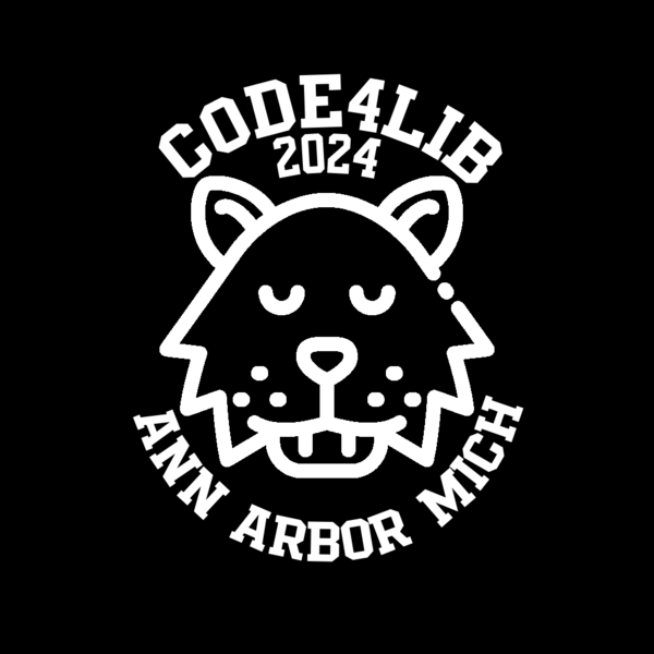
A CC0 wolverimage vector graphic rasterized with the requisite conference info circling it. | A CC0 wolverimage vector graphic rasterized with the requisite conference info circling it. | ||
| + | |||
-------------------------- | -------------------------- | ||
Latest revision as of 04:23, 24 February 2024
Voting is now open for the Code4Lib 2024 T-shirt design! The winning logo will be featured on the front of this year's conference t-shirt. Voting will close on Friday, March 8, 2024.
You can cast your vote here: https://forms.gle/cxoTACEAZNMdYi3T7. The voting form will require you to log in with a Google account to ensure one vote per person.
Details
The t-shirt color will (probably) be black, but we can look into changing the color depending on the design that is ultimately selected. If the winning design's assumed color is something other than the traditional black, we will try to get the t-shirts in the requested color. If that color is not feasible, the logo will default to white or gray, depending on the requested design contrast, on a black t-shirt.
Submissions
Emma Brown:
My design features a vector drawing of an iconic sculpture on U-M's campus, where the conference is being held this year, and the text "Code 4 Lib 2024" in brackets as a spin off of the existing code 4 lib logo. Black and white is great for this design!
Robin Davis:
My inspiration was a black & white cookie. I aimed for interesting geometric forms and nearly unreadable funkiness offset by explanatory text.
Mat Kelly:
Typographic-centric design inspired by the University of Michigan typefaces but in monochrome for single-color. This would also work well on a "Michigan Blue" shirt.
Mat Kelly:
A CC0 wolverimage vector graphic rasterized with the requisite conference info circling it.
Brandon Patterson:
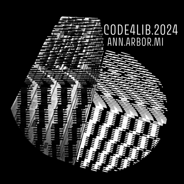
The U of Michigan's iconic Burton Tower is shrouded behind and next to a spherical omniscient jumble of lines, blending the line between technology and reality.
